Wednesday, December 30, 2009

Reflection

Memory WaitingImage by FJ!! via Flickr

I left Amsterdam in 1995, after getting my degree in Computer Science there. I was back in the Netherlands to visit family for the holidays, and did also spend some time in Amsterdam. Since I have spent so little time there in the last 15 years, my memory of the city is frozen, and, where great leaps have happened in society most, the contrast between then and now is very acute for me. Like in personal technology.

My memories are of sitting in a dark room of computer terminals in the University, closed for the winter break and thus without heating, seeing my own breath as I was trying to get my social fix (Usenet, at the time), typing with gloves on. I carried a map in my backpack because after two years I was still getting lost, and my Walkman kept eating my tapes I was tired of anyway, and lord knows if meeting up for dinner with a friend would actually happen.

Yeah, things are a little different now. My phone shows me where I am (if I want to spend the money on foreign data roaming), the texts keep me abreast of where everyone is, I have so much music with me on my iPod Touch I do not know what to play, there's always a little game to play, and the moment I walk into an open WiFi range (like the Stadsschouburg on Leidseplein) I catch up with Tweets, Status updates, and blogs. I barely used the laptop at all, actually, the little black slab took care of most casual communications. And yes, I actually like this situation much, much better. It is not just me: over Christmas my 15 year old nephews realized there really was a time people had to make do without their "GSMs", and it consisted mostly of expensive dumb beepers, difficult key combinations to forward your land-line phone to another land-line phone, and calling often to let people know where you are only to get answering machines. They were unable to wrap their heads around it.

I was struck during my stay by one technology music experience that had stayed the same: the simplest way to have a continuous consistent stream of music following you from room to room to car to workplace is still radio. Sure, radio itself has changed, with digital broadcasts and more functions and clearer stations and almost every radio being made now having presets. But the basic model is still the same as it ever was: tune the radio, get the broadcast on that specific frequency. It works the same on every radio the user will encounter anywhere, guaranteeing a seamless experience: walk into the room, tune, hear the sound stream where you left off.

Sure there are multi-room audio systems available, like Sonos, ready to stream your library into every room you have wired up with it. I have used it, it is fun, it works great, and when you walk out of the door of your house it is gone. Unless you use the other alternative, using your digital player with headphones, but even that will not pick up where the Sonos player left off when you close the front door, the same way radio does when you switch it off in the kitchen and switch the radio on to the same station in the car, to then continue to listen in the gym.

You still can't just make your own audio stream transfer seamlessly from your pocket to your stereo system to your car to someone else's stereo system even if they give you permission. Broadcast radio still does that best. Same goes actually for almost all data streams coming to us; I can't simply redirect the mobile phone call I am getting to come from my computer or the desk conference system so I can get a better hands-free experience, I can't switch the call to use the car's sound-system when I am in someone else's car so everyone can listen in. There are experiments and early systems to do it with video streams, but it mainly involves looking at the content of your Digital Video Recorder at home over the net.

It's already considered a major breakthrough when you can see the contents of one computer on another computer or TV in your own home on your own network, and it is still too complicated to set up. I think this is where I want the future to go: anywhere I go I want to be able to switch something on, make a simple gesture like tuning to a station or hitting a preset, and get whatever data stream I was experiencing on the ambient equipment. Or maybe even have that be automatic in my own home: take the headphones off when I walk in and have the stereo take over exactly where I left off.

Since what I wish for often does end up being made (a place to upload my pictures from my phone, a website to share videos, a platform to distribute writing) I am putting this out there: what I want from the future is to be able to carry any datastream with me and be able to flick it to other devices, better suited to the current location, to pick up where I left off, seamlessly. I know there have been trials and tests -- one of the more interesting ones being a system developed in the early 2000s by an MIT spin-off that let you read an article on a mobile phone and then insert it into your car so the car radio would start reading it to you from the page you were on -- but it needs to be more pervasive. I want the future that doesn't require juggling of gizmos and devices, and I want it soon.

Friday, December 11, 2009

The Difference Between a Design vs Software Education

When I worked inside Disney's Imagineering, a senior creative once told me the story of an assignment while he was getting his design degree at Art College in Pasadena. He had worked on this pencil drawing for an outrageous amount of hours, days on end, just making this drawing perfect. Come hand-in time, his drawing goes on the wall with all other assignments, and the teacher and the class gather around to discuss it. And to make a critique, the teacher pulls out his red pen and starts drawing and annotating all over it. The student can't but watch in horror. When he told the story you could see the residuals of shock about it in his face. But also acceptance: it had been necessary.

Over the years I have found out that having something like this happen, many times over, is an essential step in acquiring a solid design background, because it gives you an ability to let any idea go the moment it is ready to be seen by others, at any stage, and have it be torn to shreds and re-assembled and considered and taken away by your Creative Director and given back and smoothed and roughed-up as the team navigates the space of unknowns in a process called Designing, without going to pieces or hampering the process by being defensive. You have to go through this process over and over and over to get over investing ego into a design, and you have to get over that ego-investing if you choose to have many minds work together to make it better.

Interestingly enough, I do not remember much of this during getting my degree in Software Engineering. Most of the results were graded by whether the program actually worked, there was some cursory look at the code, a discussion of API design, and that was it. There wasn't a grind of having every line, the structure of every call, every class, every interface dissected, discussed, called good, called bad, over and over and over. Scrutinization of the coding or architecture design process didn't happen to a significant degree.

The same happens afterward. One of the most educational activities I did in all my software engineering was being part of a group code review. One of us would present a problem we were trying to solve or some object or family of objects we needed to make to allow a task, and then we would all look at the code, line by line, all of us, compare it against the style guide we chose to follow, exchanged ideas about how to make single statements or whole blocks more efficient, what pattern of the Gang of Four it fit best and what the implications of that was for surrounding code.

This exercise contributed most to making me a better programmer. And in 11 years of being a full-time Software Engineer, I got to do it all of, oh 7 times or so. Because instead of this rigorous learning evaluation, our code is evaluated on whether it works, and if not, thrown back to us to debug. We only get a second pair of eyes when we are seriously stuck, or when our code gets maintained by someone else, at which point the stories appear on about how terrible the code is on some Code Disasters site. It is so seldom pro-active before.

Maybe in some institute of higher learning about Computer Science there is a class where the students carefully craft APIs for complex libraries, and the class, as a group, evaluates them not just for whether the implementations work, but what established patterns of design they follow, what their future strengths and weaknesses will be, and how they will scale based on similarities of well-known APIs or libraries already in production. Maybe there is a class where the top graphics or sound or application APIs are evaluated against each other, and the underlying coding is scrutinized for style, brevity, and maintainability. Maybe there is a whole set of classes that is not just about making UML diagrams, but what UML diagrams are actually for. If there is, I have not heard of them; it is always "here's the API, code a program, make it pass the test suite, the Teacher's Assistant will grade the code by looking at it for 5 minutes."

Which means Software people do not get the exercise of not getting ego-invested, of being able to let the design go. In between all the buggy systems, buggy operating systems, vendor systems that do not operate as promised, a fundamental lack of knowledge whether we actually can deliver on time, budget, and spec, while the world is expected of us, we get invested in how we make it work, we get a sense of pride every time we solve this puzzle. And many of the questions a software architecture has to answer can not be asked at the beginning, or seem ludicrous (like the Twitter people ever knew when they started out they would have to run half the world, tweeting, on their systems, while hundreds of rabid startups would try to create an ecosystem on top) so it is really hard to do objective evaluations. During crunch times, scope creeps, and fickle angry customers, you hardly ever get time to create a test prototype of an architecture. You just have to do.

The result is that software architecture meetings can get testy. And that when software creator transition into the more visual or product design world, they have to learn to let go of any personal involvement of what they make, and actually mean it when they say they seek deep criticism. It is quite the little mindswitch to do when not already learned in school. But very necessary. And in the end, very satisfying.

Thursday, December 03, 2009

As The Browser Stats Churn

I have taken a contract for a digital agency, now working on an account for a mobile handset manufacturer. Consequently, I can't actually blog about what I usually blog about because I am completely in the middle of it.

Instead, I will write about something else that caught my eye. After much neglect I checked my browser stats today after forever for my personal site. My personal site really has only one noteworthy page, the PHKL page, which, 10 years or so after it was put up and now that there are plenty of competing products out, still gets 2000 hits a month. What caught my eye was the follwing table:

Operating Systems (Top 10)

Operating SystemsHitsPercent

Windows3203786.8 %

Macintosh33168.9 %

Linux7231.9 %

Unknown7061.9 %

Nintendo Wii580.1 %

Symbian OS280 %

Sony PlayStation Portable50 %

Sun Solaris30 %

Two gaming machines get used more for browsing that Solaris. Which is a startling statistic for anyone who still remember when Solaris was The Future of UNIX, and UNIX actually counted for something, which is people, like, well, me. I guess I am Old School now, and am wondering what those game whippernsappers are doing on my lawn.

Well, that, and the current crop of Solaris users deep inside SUN and academia are simply not that interested in pink kawaii laptop hack mods.

Tuesday, November 03, 2009

Some CSS Trickery Recorded For Posterity

Several mobile phonesImage via Wikipedia

I don't usually put development issues or code here, wanting this to be a space where I am not very technological, but I just needed to record this somewhere. It's about making websites that scale nicely from a full web page to a small handheld screen.

In an ideal world, part of the mobile strategy for a web property is that the design team thinks very carefully which parts of the functionality and user exeprience they want to preserve or highlight for mobile devices. Then they carefully categorize the classes of handheld devices it will be shown on, and write their mobile content to this categorization like Bryan Rieger illustrates, and configure the servers to sniff which browser is being used and redirect to the right content.

And sometimes you have 2.5 days to finish a brochure website and you need to slam something out for handhelds that just gets the information across. Which is the scenario I had to deal with a few weeks ago.

I am not talking about a complex website with user flows and shopping and profiles, but about the many many sites that basically have one center block of information per page, some navigation, and some secondary content. Looks great as a 3-column on the desktop browser, really should be transformed to a one-column site with simple navigation on something small. Which can be really easily done using standard W3C style-sheet CSS technology: make one for the desktop that is all beautiful, and one for handhelds that switches most content to be invisible and the navigation to be simple, and set the right switches in the header to tell the desktop browsers to load the desktop style sheet and the handheld browsers to load the handheld style sheet.

Except, of course, from the moment the technology was specified, handheld makers were subverting it by basically ignoring the handheld directive on their flagship phones, telling their handheld devices to ignore the handheld CSS and always load the desktop one, basically claiming their scaling technology for every site was better than what a webdesigner taking the time to carefully create a handheld CSS for a specific site could come up with. Browsers with delusions of grandeur, like non-touch Symbian devices and Blackberries, all with screens no taller than 400 pixels.

Dean Hamack over at Bushido Designs details the sad state of how handheld browsers are all very different and not listening to standards, and the bullet-proof trickery he uses to make desktops and handhelds load the appropriate style sheet, using careful cascading of imports and media directives. But in the comments he points to having found a simpler way, and after having done some of my own experiments I concur: just using JavaScript in the header is the way to go.

This was not how it was supposed to be, and the usual recommendation is not to use JavaScript for something as vital as overall lay-out, as JavaScript can be flaky or never have been implemented or switched off. But I think this thinking may be outmoded, as the JavaScript in question is very simple, a good alternative is available if there is no JavaScript, and the most problematic browsers -- the ones on handhelds with delusions of grandeur -- have, as part of their delusion, JavaScript implemented and switched on by default. Well, we should take advantage of that.

So my current stack of CSS includes in a page header looks like this:
<noscript>
<link rel="stylesheet" type="text/css" href="handheld.css" media="handheld">
<link rel="stylesheet" type="text/css" href="desktop.css" media="screen">
</noscript>
<script language="javascript" type="text/javascript">
if(screen.height > 320) {
document.write('<link rel="stylesheet" type="text/css" href="desktop.css" media="Screen" />');
} else {
document.write('<link rel="stylesheet" type="text/css" href="handheld.css" />');
}
</script>
<link rel="stylesheet" type="text/css" href="iphone.css" media="only screen and (max-device-width: 480px)">
<link rel="stylesheet" type="text/css" href="print.css" media="print">
<!--[if IE 6]>
<link rel="stylesheet" href="ie6.css" type="text/css">
<![endif]-->


I start off with directives in case JavaScript is switched off or not implemented ("<noscript>"), in this case we are most likely dealing with a desktop browser run by a purist or a handheld that knows just fine it is a handheld and didn't even try to run JavaScript, and the media selectors in both directives will be honored properly. A designer might even take the opportunity to make a desktop CSS that shows an alternate display of any items that depend on JavaScript working. We could also be dealing here with a handheld with delusions of grandeur of which the owner has switched JavaScript to off, and then we are back to square one, and I am hoping this is a very seldom case.

Then comes JavaScript that basically checks how big the screen is and then loads the appropriate style sheet. This can be as complex as you want, covering every eventuality of screen shape. I just went for forcing a handheld style sheet on devices that simply have too small a screen to pretend they should be ignoring the handheld media directive and will otherwise load the desktop one -- I am looking at you Nokia E71; you are a wonderful handheld device but you have no business ignoring a handheld CSS if it is available, which you do, and really shouldn't.

A designer could even design to set the cut-off to a larger device, like 480 pixels of height, forcing this stylesheet on iPhones and Android devices as well, but I am finding the machines that run these operating systems run and show and scale and zoom simple desktop sites just fine, so I am willing to let them try. Although, in the next line I do use a CSS media directive to load an iPhone and Android specific style-sheet, because I recently found that WebKit on those phones have different behavior from WebKit on the desktop and that sometimes needs to be compensated for.

And then of course, a print style sheet, and some trickery for a style sheet to be loaded only on Internet Explorer 6. That browser we are never getting rid off, so we will always have to deal with those bugs. I prefer to isolate them in a sheet of their own.

No, I haven't exhaustively tested this on every Blackberry and Nokia and handheld and OS possible. But I think I am covering a lot here just fine.

Wednesday, October 21, 2009

Show Off

I bet the Nook also really shows off well what books you have with that coverflow screen on the bottom. So you can casually show off to everyone, from friends you are showing it to, to over-shoulder-readers in the bus, just how literate you are and what good taste you have and what media-tribe you belong to.

Tuesday, October 20, 2009

Does This Look Familiar?


Just confirmed by Barnes & Noble: the Nook -- seen here to the left -- their competitor to Amazon's Kindle. A black & white -- well, gray on white -- electronic paper display that is readable like a book in bright sunlight, with a color touchscreen on the bottom for flexible controls. It runs on Android 1.6, so that color screen most likely will show a touch keyboard.

Hey wait a minute. Where have I seen that before?

Oh yeah...

My friend Mike and I kinda came up with that device style -- mock-up to the right -- when we looked at the Kindle 2 and didn't like it all that much.

B&N STOLE OUR IDEA! Well, no, not really, I bet; multiple designers will look at the same problem and come up with the same solutions since we all live in the same world. (But if they did, send us free ones and we'll call it even!)

Well, what is next?

I remember when I started work in 1999 for Nokia on the WAP toolkit for making Mobile Internet Sites that we would all see these concepts of where phones were going in the bright and glorious future. Mostly, large color screens, front and back cameras, video calling, and strange egg-like shapes. Pretty much everything has come to pass except for the egg-like shapes. Sure, Nokia tried a bit, got good reviews for the software and bad reviews for the crazy hardware, and we are now all back to slightly curved rectangles, with or without keypads popping out. This is why pretty much all smartphones are boring me these days: box box box box box. Even the iPhone is too boxy with all that black.

Yet the concepts out there for personal communications are about armbands, curves, shapes that bend to the body for carrying but straighten out for viewing. You can't see a video or publicity still for a new display technology without some person in it trying to bend it, twist it, show how thin it is. Foldable screens are a way to deal with the issue that we want a device to be big when we are looking to interact, but tiny when we just want to carry it on our person.

So I am ready to say that this is where the future will go for electronic ink and for phones, media players, portable game machines: they will be full color, high resolution, and fold out, bend, clasp around your wrist or disappear into your pocket. Many will flirt with being wearable, but not everyone will want that (my wrists sweat too much for a watch to be comfortable, for example). They will have adjustable font sizes as an increasing amount of the population grows older, and they will upload and download everything without wires or memory cards. And when they are widely available, you can ask me what come after that then.

Wednesday, October 14, 2009

Let's Do That Debate Again!

First there was HTML, gray backgrounds with black text and blue links, and information was just let to flow on the page.

  • Then came the need for an 'experience', and newly minted web designers started asking how big the average screen was, because scrolling was evil. 640 by 480 pixels was a target, while many decried that as too big and leaving too many people with smaller monitors behind.
  • Then came debates within the 'experience' community whether enough people had migrated to 800 by 600 screens, with many decrying that target size as too big and leaving too many people with smaller monitors behind.
  • Or even 1024 by 800 pixels wide, with many decrying that target size as too big and leaving too many people with smaller monitors behind.
  • Then monitors became cheap as dirt and the only debates were on what content should be 'above the fold', because scrolling is evil: users won't do it and if a function is not sign-posted in the top eye target hit area, users won't look for it.
  • Then we had the whole debate again for tiny screens. Scrolling: even more evil. Well, it was indeed a pain on most WAP phones.
  • Then the iPhone made scrolling such fun users were doing it to pass the time. I wonder if there's an app to let you endlessly flick up and down and shows twirling colors or something when you do.
  • Now smartphones are running full browsers grabbing full pages on small screens, making the user scroll again, while inching to become the primary if not major secondary device with which a user accesses the web.

I foresee a new debate in many a digital agency about whether 640 by 480 is a target resolution that is leaving too many users behind.

Thursday, September 24, 2009

Vodafone 360

(Yes, I have been absent for almost a whole month. Sorry about that, but I have been consumed by my work life.)

Congratulations to Vodafone on their vodafone 360 announcement. vf360 is a set of services that can be accessed from PCs and mobile devices, with two purpose-built phones ready to launch and software available for installation for 100 models of phones, to manage music, photos, contacts, social networks, updates, friend groups, blogs, and all that other goodness wherever you go.

I saw some of these ideas when I consulted summer 2008 in Düsseldorf for Vodafone's UE Group, and I was impressed with the ambitious plans they had to seamlessly put the user in touch with their data everywhere. We actually could use all the help we can get managing all our social networks and status updates and media and chats, as long as it the tools take into account that we have different personas and levels of access to different people, and embarrassment can be huge when you say the wrong things to the wrong group. So far the press release is making the right noises about that.

There is the worry that they do not integrate with services people actually use -- like no AIM? Oops, not good for the US market -- but hopefully new interfaces will be built. Voda is already making a lot of money available for a contest to develop the best apps on top of this platform. It's a step ahead from just being another app store, but being a conduit for services from developers instead. If Vodafone nurtures this globally this could get very credible and interesting.

Thursday, August 27, 2009

A Random Thought

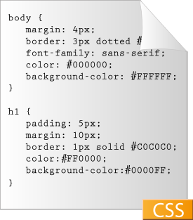
A graphical depiction of a very simple css doc...Image via Wikipedia

I am starting a cycle of CSS wrangling for Betavine, the project I am working for. I am part of a usability team that does the full service stack for front ends, from concept all the way to final pixel pushing, which means that some weeks I am user-testing a prototype we all concepted on, and some weeks I am looking at 7 browser or so to do the CSS voodoo to make all our ideas look the same everywhere. Which is why styles and looks for web properties are on my mind, and the amazing amount of pain everyone in the web space goes through to make it all look super put-together and 'professional' and 'on brand'.

The early web was terrible at it, because it was a medium built for documents of information, not 'experiences'. We've had 15 years of adding technologies to change that, and 15 years of browsers all doing the technologies their own way, and the result is that making these experiences is like herding cats: it actually can be done, but you'd better have a good reason for it. It's funny how you can easily lose 3 days in meetings with a major enterprise discussing the Return on Investment [ROI] of hiring an intern to write a company blog and make customers feel listened to, while nobody seems to tally anymore whether it makes any sense to send money to an army of CSS coders and visual designers to make sure the logo floats on the left in every browser exactly the right amount of pixels as specified in the brand book made 3 years ago by some consulting company three countries away. (I probably shouldn't question it either: it keeps me partially fed.)

Still, I recently noticed something about my GMail window: like Craigslist, it is actually quite ugly. There's no grid. Things don't line up. If the Golden Ratio is being used anywhere, I am not seeing it. The buttons are all kinds of sizes. It still succeeds because it is so stripped down the imbalances aren't offensive, and it does what it has to do perfectly. Same with Craigslist: no visual designer is using words like 'integrity of the design' to tell us why those columns have to be just so but you can get around great on it. The former head designer of Google may have quit because everything was so 'data' driven instead of by 'aesthetics' or 'soul' but that doesn't seems to have stood in the way of attracting users by making the site really simple and deliver the best search results.

I opened Amazon and Barnes & Noble side by side and looked at them. B&N has all the gradients, the stripey background wallpaper, the feel of careful placement of elements, Amazon is still its fruit salad mess of saturated orange and blue high-contrasted against white. And, highly personally and subjective, I realized I put less trust in B&N's site. It's too produced, too corporate, to designed to be soothing and friendly, but these days a corporation with a smile scares me because I know that corporations in general only smile when they take my money. I go to a book website to buy a book, not to be told I should feel soothed for being on that website. Things got better once I clicked on an item, at least the item was on an item page, not a 'quiet oasis of media browsing evoking old world charm'.

Ok, here's my point: I think every adult in the capitalist world -- hell, every human from the age of 5 -- must have a developed sense of skepticism towards large corporations to be considered functional. We realize we get shafted by corporations the day it turns out a shrink-wrapped action figure is not hours of fun like promised, especially without the accessories that are sold separately, and life dealing with them barely gets any better after that. Newspapers get it wrong. The glossier the magazine the more it hems and haws about whether the products from their advertisers actually work.

So when a website goes balls out to look like a glossy -- fonts, arrangements, meticulous full bleed backgrounds, purpose-shot imagery with the right models, the whole thing screaming professional and brand and designed -- it may not envelope the user in a sense of familiarity and love. It may just arouse skepticism (after or during the irritation of trying to find the 'Skip Flash' button or the volume icon). It may instead raise the shields of skepticism that we all need to even survive the bullshit thrown at us in even a simple department store.

I think you actually can go too far in making a website beautiful and brand-perfect. I think beautiful gorgeous experiences from large brands evoke skepticism instead of lust, especially if the product or service it is selling is actually not that special. It ends up feeling like a cover-up. And also then, the websites that are most popular, facebook, twitter, myspace, are very careful about giving great functionality while not looking like a juggernaut corporation with an army of abused web-monkeys being commandeered by brand managers (even if they are).

Now, this isn't a very well worked-out framework I have here for evaluating trust vs design, just a thought. But I think I need to explore it further.

Thursday, August 13, 2009

Consumption

There was this User eXperience meet-up last night in London which I missed, but did see some tweets from. The tweets were discussing content-scaling, which must have been a topic: how to repurpose and reformat the same content as the user goes from web to TV to mobile. And maybe it was because I was just coming back with a full stomach from going to a Curry place in Shoreditch with deliiiiiiiiicious food, but all the tweets about content made me think that approaching 'content' as a generic concept to adapt to situations makes about as much sense as talking that way about 'food'.

Food is a great big huge world of items, but its expressions are very bound to the time and place and experience the eater is in. Every moment and activity has its own food, and nobody treats food as if moving it from one space and time to the other is a technology question.

-- "So we make all these four course meals with soup and a cheese platter, how do we make our skills useful when our fine-dining consumer goes to the movies? A bag with compartments?"
-- "OK, we're giving them fries, burger, and a shake in 5 minutes or less when they come into our joint, but how the hell do we manage to keep this consumer when they are at a cocktail party?"
-- "This tub of microwave popcorn with real butter we sell for TV watching, can we scale it for commuters? Drivers in a car?"
-- "Marathon-runners really enjoy our gel-packs. Surely there's a way to extend our brand loyalty to their other leisure moments."

Nobody expects these questions to be answered with one scaling technology, or a complicated set of heuristics, or even a single philosophy. Yet in the mobile UX world many smart thinkers actually do try this when approaching the problem of how the astonishing amount of types of content we have all created now over the years needs to be transformed to be seen on a tablet or phone or computer screen or TV.

It is not only the context of the user that changes during their day, although 'context' is what a lot of UX practitioners get stuck on, but, more encompassing than context, it is their needs and desires that changes, tied to where they are and what they are doing. I don't want a Thanksgiving Turkey dinner at 4PM on my workday even if you could deliver it in a way I could carry to work and eat surreptitiously at my desk, I simply want my tea cake. Or whatever 4PM snack you are into.

So yes, maybe the content of our hard disks should be looked at as ingredients that need to be cooked with specifically for every time, place, and need, instead of seen as meals that simply need to be transformed 'right', and all the talk of transcoders and scalers are just complete doom that will at best serve bland, mediocre, ill-fitting media experiences that seem to miss the point, or at worst try to pack a three course meal in chewing gum -- and we all saw how that ended up for Willy Wonka's prototype tester.

And I felt I was really on to something deep here. Or maybe it was the chicken Tikka-Massala talking.

Tuesday, August 11, 2009

Getting Out The Vote

Recently I was part of a conversation about basic voter apathy leading to extreme parties having representatives in local coucils, that ended with "but of course those people can't go to the polls but they will all vote for [X-Factor / American Idol / Big Brother / Strictly Come Dancing / Dancing With The Stars winner]" Well, yes, and if you look at voting as a usability issue, it's very clear why:
  1. The alternatives are presented very clearly and together. All contestants are together at a predictable time, attacking the same problem (singing a song by a composer, entertaining, being an amusing idiot) with the same tools.
  2. There is guiding meta-commentary. Ok, maybe you do not like the judging panel, but they at least focus on what the issues are, don't let people get away with mediocrity or handwaving, and help voters to focus on the issues at hand, (or at the very least make viewers tune in watch the Vicodin trainwreck).
  3. Following the 'debate' is pleasant. The shows employ the best people to make sure the 'debate' is something you want to see. The camera work is top-notch, the director keeps the rhythm going, the set is exciting, everyone does their best not to put the viewers to sleep and keep them involved, pumping them up to vote.
  4. Voting is comfortable. You do it from your own home with your own tools that you know.
  5. Voting is presented clearly. The absolutely best people at explaining technology to uncommitted users are employed to make short eye-catching video segments with glitz and animation to show people how to text for a specific winner. These segments are repeated often.
  6. Voting is made fun. The whole atmosphere around getting the vote out and the voting itself is full of enthusiasm and joy.
Now, the results of the voting are actually not that good; not every winner has fulfilled their promise as a celebrity or entertainer. Plenty of them have, though, so the voting public is not too bad at this actually. But if you look at the problem of voter apathy as a usability professional, as someone with the mindset of "What do I need to do to get people to fulfill this task?", (how do I present the task, how do I structure the task, what messaging do I need to put around the task, how do I influence the attitudes around the task) it really seems like the whole environment of going to the polls, of voting in local or national politics, actually does a lot of work to drive people away from participating by making the environment boring, the debate hard to understand, and the process difficult.

Tuesday, August 04, 2009

Electronic Friendship Regrettably Is Too Often An All Or Nothing Proposition

I have many asymmetrical human-to-human relationships. People who are more interested in my time and thoughts and presence than I am in theirs, and people whom I would like to get to know better and spend more time with who are not as interested in that as I am. We are a jumble of ideas and experiences and ways of expressing ourselves, and to create a good relationship of any kind, they have to match on some level. And often they don't.

We have centuries of rules, customs, and collective experience on how to manage this. It is an essential lesson of socialization to recognize the balance in a relationship, how it is shifting, and how to maintain it, at the comfort level of all participants, without being either too passive or aggressive. We can't evaluate relationships yearly with a questionnaire and a 1 to 5 scale like happens at jobs ("Well, the amount of texts you send is optimal, but the amount you cling around me at gatherings really is a 3: Needs Improvement") so we rely on cues. Most people's egos are not strong enough to handle direct communication on this level about how welcome they are, to the point that "He's just not that into you" as a sentence required a book and a movie to be celebrated properly as an idea. Nobody likes to be rejected, so people who blatanty reject get labeled 'mean', and the rest of us try to be gentle.

We handle the asymmetry by the amount of time we give, how long we take to call back, how often we actually do go over to watch the slide show, how much effort we do to see someone when they come through town. We can manage our exposure to each-other, how much time we invest, because physical life allows us to create gradations (and when it doesn't, well, there's always the assertivity training to learn to set boundaries, or the restraining order.) But electronic life really does not.

The current juggernauts of connecting, Twitter and Facebook, are really all-or-nothing relationships. There are millions of levels of friendship in physical life, yet Facebook really knows only one, and has limited controls about how you expose yourself, of which the results are really quite blatant to the follower. While setting them up last night I had to wonder if agreeing to friend someone but then putting them in a very limited group that couldn't see my stream of status updates isn't almost a snub worse than ignoring the friend-request altogether. (But no, 15 y.o. nephew, you really don't get that much access to my life.)

Twitter understands relationship are asymmetrical, where Facebook does not, but then expects them to be all-or-nothing. Yes, you are following my stream, and I know you in real life, but I am not sure I want to read every URL you find in your daily Net Grazing, crowding out the more seldom items from my friends. Third-party tools are trying to fill in this usability gap by allowing Twitter feeds to be grouped so you can keep the high-value Tweeters close to your heart while relegating the less valuable ones to the group you may check once in a while, while seemingly being a great social butterfly mediator person who is connected to everyone and everything. But I have to say that when I get a heartfelt invitation to "Follow me on my Twitter feed!" that already has 16.000 followers, I wonder how much value I will be able to bring to this relationship. Especially if I then get followed back among the 14.000 people this account follows. That is why I find email that I am being followed by what turns out to be an Affiliate Marketing robot so soothing: pretty much nothing is expected from me, and I get to look as if I am more interesting with that extra follower: WIN!

Most blogging have equally or even less sophisticated systems of privacy and mediation of relationship. LiveJournal and DreamWidth have a very sophisticated system for grouping followers for who can see what. The other blogging systems seem are all-or-nothing, and seem built for people who want everything they have to go out there to everyone in what are write-only systems with primitive comment fields attached. Blogs really are about publishing, not relationships.

And this mismatch between how electronic and away-from-keyboard relationships end up being conducted is really curious, because the software world is really good at filtering. Filtering by name, time, content, exposure, it's all in a context-switch's work, yet these things are not there. This could be because filters add complexity, and users actually do gravitate to simplicity over looks or features (see, respectively: Craigslist, 1st generation iPods).

I keep wondering if this is because these systems of connection grew up together with all-you-can-eat broadband in the centers where they were created. Back in the Usenet1 days, when IP connectivity was indeed metered, there were pretty sophisticated filtering systems for the stream of articles created globally by participants, and they acted on the server side before the article was transported, character by character, down to the reader. There actually was a monetary incentive to not receive too much crap, and computers assisted users -- if primitively -- in making that happen, instead of being open pipes to everything. But even then I was glancing at the amount of characters on my screen, together with the content in the From: and Subject: headers, to make a snap judgment on whether to hit the space-bar before even reading the first sentence an awful lot.

If broadband had always been metered, like it was early on mobile phones, would the systems created have allowed us to manage how much our new friends take over our time better? The early history of data applications on mobile phones, when data usage charges ended up on our bills measured in kilobytes, points to this being a moot question: like mobile application stores only took off when people didn't have to worry about how much data would cost on their iPhones, in a pennies-per-kb world the Web would simply have not taken off as it has, and electronic communications would have remained a beep-beep-doot-doot-modems-in-basements hobby, and I would still be sitting down with a travel agent to book an airplane ticket.

Instead, the Web took off, we will have to use our brains to navigate what the networks bring us full-blast 24/7, and hope for some model to arise that is much like the people who have to fiercely guard access to their time and person use: a personal assistant that trudges through the information and passes on only the best, a sort of human spam filter that keeps all the balls in the air, and writes coherent and targeted answers back while the celebrity in question gets to bark out strategy commands, and then gets to vacation in Hawaii again to escape the stress. The rest of us just get to hope we do not bruise egos too much when we click "Ignore" on a friend request, or remove a stream that is just not interesting.

1Yes, I was on Usenet. Indeed, I passed my 20-years-on-the-Internet a few months ago, which means I am a Question 2 social media expert outlier. I am still not sure of what it means that I looked at most of that article thinking 'My gawd, are you serious? I could get paid for this? Or do I have to only talk about margarine on Margarine blogs?'

Wednesday, July 29, 2009

Two Good Reasons For Sprint To Acquire Virgin Mobile

Virgin Mobile USAImage via Wikipedia

  1. The data-center Helio built for hundreds of millions of dollars of SK Telecom's money, that Virgin Mobile ended up with when they got Helio. Helio built it because Sprint's own was, well, not up to Helio's mobile media needs. To put it nicely.
  2. Shore up Sprint's subscriber amounts. Sprint's bleeding subs like a stuck pig.

Saturday, July 11, 2009

It's The Whole World, Stupid

The whole USA vs Europe blog-fest on who leads in mobile innovation is just so dumb, with Scoble measuring country of origin of popular smartphone operating systems vs European manufacturers. Nobody cares except nationalists who confuse the bits made in Silicon Valley of the whole experience for all of the USA, and Google's and Nokia's global labs for a single continent. Without HTC, Android is nothing, so now the epicenter of mobile innovation is China? These are all partnerships of innovating, enabling manufacturers of hardware and software.

Mobile innovation is global, and wants to have global markets. Innovators will go to a platform not because the meet-ups and business-card exchanges are in London or Silicon Valley -- although Silicon Valley sure likes to think so -- but because the platform has
  1. Access to a huge audience
  2. Makes it easy to deliver wares
  3. Makes paying and getting paid easy.
That's all it takes to attract innovators and 3d parties.

And from that we can see what the gatekeeper is for innovation: the operator. Apple forced their first operator to make it easy to deliver wares, including data streams, by demanding their device be only sold with data-unlimited plans (with a few exceptions) and no crippling like walled gardens, and Apple made an easy payment platform. But Vodafone and Telefonica and China Mobile have just a great or greater reach than Apple, satisfying point 1. They can, even if it takes a humongous change in attitude, create a platform that satisfies 2 on every capable phone, and then supersede Apple and Google in point 3 by allowing apps to be paid for with the phone-bill, unlocking the spending potential of every Pay As You Go user on the planet who no longer needs to beg their parents for a payment card. Nokia's Ovi will blaze through 1, still seems to be stumbling on 2, but I know they understand 3.

You do that, Voda and O2 and Hutchinson, you allow some kid in South Africa to sell her penguin game made from pictures she took in her back yard to a mom in Panama who has 30 minutes of spare time while waiting for her shoes to be fixed in the shop, and innovation will come from everywhere and in amounts currently unimaginable.

Thursday, July 02, 2009

One Web Is Here

Image representing Twitter as depicted in Crun...Image via CrunchBase

So, that mobile web. First, called WAP with its WML and WMLScript, it was conceived to extend the very basic software that ran on phones a ta time the most sophisticated ones might have had grayscale screens, yet was to have worked equally well on simple pagers. Unfortunately, this system of using the data network to download pages and small application decks was labeled 'the mobile Web, and thus people expected the web on their mobile, and they didn't get it, and they ended up disappointed. Exit the first WAP technologies.

Then 'the mobile Web' was re-conceived to use XHTML and CSS with all kinds of extra switches called 'mobile profiles', which were all about leaving half of the styling out, and companies like Nokia pushed the idea that if we just use those technologies for the most important pages, we can make the Web, The One Web, easily scale up and down, without needing to split the web into one for big screens and a special mobile web. While at the same time sponsoring the idea of a whole top-level domain, .mobi, that was for special mobile websites only. Neither is working: I am seeing far more 'm.' or 'mobile.' sub-domains of .com sites than specialized .mobi sites, and few pages are designed to use the technologies to scale up and down well. It's not easy to create something that is both a general website for big screens and a highly individualized relevant experience on a mobile.

We are in hell, as web creators looking forward. Scaling both up and down is hard, it only works if your website has a totally simple proposition, or if you are willing to chuck 80% of your interactivity out when scaling down -- and your users will actually miss that 80%. Our tools, like static wireframes and IAs, don't help us, our clients mostly have visions only of the pretty pictures of rich sites and have a terrible time dealing with their brand having to not always be one huge whiz-bang festivity, and on top of all that we actually are chasing a moving target when we have to say how far to scale down, as phones get significantly better every 6 months and the upgrade cycle is 18 months. Look at Facebook's mobile site: all applications, groups, fan pages are either gone or hard to get to on its mobile site; there's just your news stream updates and the comments to them. Which is great on most phones now, but is actually leaving the high end phone users behind as too constrained and not interactive enough. Making something that works on the low end will look flat and boring on high-end phones.

Still, it has to be done. We have to go to One Web, with liquid layouts and sniffing what device is hitting your page and ready to switch from serving Big General Page to Personalized Small Chunk. And the reason is Twitter.

Twitter is a true One Web application: its proposition is so simple that it easily bridges mobile and Big Screen access. Twitter serves responses as easily to a web page as to an SMS as to a specialized desktop application, and users use all modalities, often switching seamlessly between them. It is also huge. Huge. Gigantic. Everyone's on it, and they are tweeting URLs to each other, URLs of other web pages they have seen. And their followers are as likely to click on those URLs from their computers as from their iPhones. And if that URL goes to your site, and your site can't adapt to the wild variety of devices people are using to get to you through a tweet, you are losing audience.

If you have a simple blog, you seriously need to check how your template looks on a Nokia E71 a BlackBerry Storm, an iPhone, a G1 (and yes, I need to do that myself for this blog). If you have a news or information site, sniff who is coming over and automatically redirect them to your mobile site for the same story (you have a mobile version of your site, right? I mean, you mostly serve text and pictures? They scale down beautifully). Get ready. Get a strategy.

Maybe we need to turn the process around: start out with sites that have really simple content suitable for low-end mobiles, and use AJAX and animation to bloom like flowers of interactivity when the site notices the screen is big enough, unfolding new modalities and content types to just the right size from very simple to mid-range to netbook to desktop to dual 30" cinema screens. It will require unlearning all we currently do for the average site on both the web and the mobile web, and using and creating all new tools, but it is time we tried. We need to do something. Because if our sites are hot they will be Tweeted, and people will try to get to them from their desktops and their pocket devices, and we will want to serve all those users. And as Twitter gets augmented or supplanted by more services around the globe with strong roots in phones and SMS, services that equally bridge access devices, it is only going to happen more, not less.

WAP failed because consumers didn't want two webs. They want One, everywhere, relevant, and accessible with what they are carrying.

Thursday, June 25, 2009

The Messaging Is Actually More Difficult Than Designing The Product

Koninklijke Philips Electronics N.V.Image via Wikipedia

While most non-Asian consumer electronics companies are either dead or a shell of their former selves after being unable to cope with razor-thin margins, at least one has tried to innovate itself out of the hole by leaving traditional kitchen machinery and living room HiFi behind. Philips, the originally Dutch consumer electronics giant that twenty years ago ruled by introducing the CD player and really only survived the 90s because of its lighting products portfolio, has been trying to stay relevant by stepping out of the race of me-too products they could not make a profit on anyway, and instead go for consumer electronics nobody else made.

Sure, they still make flat-panel TVs, but their TVs have a feature, or gimmick if you will, that they emit light to the sides that is the same color as the predominant color on the screen. They tried to turn color LEDs into a consumer product by releasing a flood light whose color could be changed by remote control. They create mobile phones with almost no features but batteries that last forever.

Their latest foray is trying to pull electronic sex toys out of the niche of candy-pink plastic ickyness of ugly cords and shapes that are either too crude for words (how many guys really want to see their partner play with an exaggerated enlarged cast model of some other guy's dick he can never match? Well I can kind of guess, but it still seems a small niche for a manufacturer) or a little too much on the humorous side (Yay dolphins. Bunnies. Or most often something that is best described as Shape by H. R. Geiger, Colors by Sanrio).

I think Philips is basically trying to put the 'adult' in 'adult toys'. Does the Audi-driving iPod generation really not deserve something that makes them feel sophisticated in the bedroom? Well, they are trying.


Philips' new range of 'Sensual Stimulators'. From left to right: the Warm Stimulator,
and the dual Sensual Stimulator set displayed inside and outside the case.

I couldn't find the press release in English, only in Dutch, and I will just discuss the highlights here.

They are introducing them under the product category of 'Relationship Care', and the Dutch prose for the press release tries very hard to take on an adult design-oriented tone about touchability, stimulation, design, and features like that the first one can be set to heat itself in the charging dock before use, the other two are made for Him and Her, they are all waterproof for use in showers and baths, and "made to get in the mood for more intimacy". Some copy-editors must have stayed up nights just to get this right. Interestingly enough from the gender-equality P.O.V, the clitoris is mentioned, but for men they only get as explicit as "his intimate contours". I can't help but wonder what the meeting was like in which this difference of approach to anatomy was settled on.

Anyway, more power to them. Philips wants to try to get sell these products through channels that are not traditionally associated with sex toys (like what, general product mail-order catalogs like Neckermann and Sears?) but has not disclosed price nor availability. Oddly enough, while the Dutch press release mentions a product website, at this time it is not live.


Saturday, June 06, 2009

Steak-holding Stakeholders

TescoImage via Wikipedia

I had just joined the line at my Tesco (supermarket chain in the UK on the cheaper end) for the self-service check-out, cursing that I would subject myself to those horrible machines yet again. The alternative was joining the staffed queues, each with a customer or 3 already waiting, shopping carts filled with enough food for an army regiment. I heard a voice calling from the 10-items-or-less line. That line is usually closed in the evenings, so I was surprised to see it was staffed right now.

-- "I am surprised, this line is usually closed."
"Yes, I am trying something new to make things better."
-- "If you really want to do that, fix your self-checkout machines."

They are a case study in how usability is more than logically placed buttons and clear pictures and even a friendly voice. Usability is not just going to be fixed with a nice sauce of wireframes and good visual designers if the underlying system does not support how humans act.

Humans want to get things done quickly in a supermarket. They want to scan quickly, put the item away, and go to the next. They don't want to have to wait for a slow scale that needs to have the item placed on the belt just right 5 times before it registers, they don't want to wait to go to the next step of paying and getting a bill until the voice loop has slowly and painfully spoken about what button you should touch and how it will give you clubcard points when the human already knows from previous times, they don't want to wait 5 seconds between pressing a touch screen button and the screen reacting for god knows what reason in an age their game computer at home will penalize them for clicking a millisecond too slow. I defy anyone to use these particular machines at that location more than three times without wanting to punch their screens out in a fit of hot rage. No amount of perfectly chosen colors will compensate for the aggravation of having to use a machine that expects to impose its own order and speed of doing things.

Especially when it is unnecessary. The self check-outs I used in the US were all fast, scanning and itemizing quickly, not needing to finish their display animations and prompts for one item when the user was already scanning the next or inserting coins, simply paying attention to its input and processing each as fast as it could. As a result, they never got as confused as the machines in my Tesco do, they never needed as much human attention and help, and one supervisor could indeed check all four of them without being overwhelmed. Actually, this goes for the self check-outs I saw at Boots (a UK drug store chain), which are obviously from the same manufacturer as the one in Tesco, yet did not get in the way of the actual checking out.

"Yeah, we know about the machines. But we finally convinced the manager who is responsible for ordering them to stand at the supervising station for a full day. He will be ordering new ones."

That is the second lesson: nothing's gonna change about a painful system until the people with actual power experience the pain. Customers complaining, systems being down, staff overwhelmed -- doesn't matter; if customers can't use them they will just get in line for the manned check-out counters. Once they are inside the store and have full baskets they are captive anyway. But make the guy holding the purse actually feel what he is doing to his staff with that terrible equipment, and suddenly all kinds of upgrades are possible.


Monday, May 25, 2009

Stupid Recruiter Shenanigans

I could fill half of this blog with the 'fun' I have had with job recruiters since Disney Mobile imploded as I tried to find the next step in my career. In fact, when I was still in LA, I did, about insane location matching, ignorant lying automation, astounding lack of technical knowledge, and just plain incompetence and repetition. I haven't had as glaringly dumb moments in the UK, but there still have been, uh, 'fun' moments. My current gigs I found by going to meetups with a stack of moo cards and finding someone who needed my skills. We have been working well for the last 5 months now and want to do much more.

My latest beef is just mindless external recruiter inanity around the cloak-and-dagger game of trying to interest me for a job without telling me who the job is for. I understand why recruiters don't want to come out and say who they are recruiting for-- no wait, I actually don't. I see two options here:
  1. The external recruiter has the commission from the company to be the people recruiting for that company. In that case, since I am not at the sooper-dooper CEO level where the knowledge the company is trying to find someone will send the stock crashing (but finding out they are after me of course will send the stock soaring), the recruiter should be able to simply tell me, because if I do a run around the recruiter, the company will send me right back and say 'please work through the recruiter'.
  2. The external recruiter does not have the exclusive commission, so of course they can't tell me for which company they are recruiting, because I then actually will go do an end-run around them. The external recruiter is injecting themselves into a process between two parties where they haven't been asked to be, eating up a fee off my future work that could have gone into my pocket or kept the company in business longer, and, as is obvious from my examples, overwhelmingly not giving much value in return: no feedback on how to increase my chances, and as I have found, terrible skills-matching. In that case, get out of my life and stop making this process harder.
But, that aside, the modern way of working seems to be this, often somewhat coquettish-looking, hiding of the employer. Ok, let's take that as a given. In that case, dear external recruiters, if you must, could you at least stop being outright dumb about it? Example: I recently got an email inquiring whether I wanted to work for 'a global leading electronics consumer brand' in Eindhoven.

No, seriously. I am Dutch. My CV very clearly states so. Thus, I know the Netherlands. There ain't that many brands there, people.

Ok, for those who don't get it because they do not know this part of the world well, it's like describing a job for 'a leading global software powerhouse' located in Redmond, or 'a well-known mobile-phone manufacturer' in Finland. What is up with this kind of coded communication when the answer is so obvious? Are these recruiters -- yes, stuff like this happened more than once -- assuming I do not know my own industry that well? Or that I need to have what is blindingly obvious sent to me in code? The scarier thought: this recruiter does not know how insanely obvious his 'riddle' is.

Standard disclaimer here how not all external recruiters are bad, I actually have -- no really -- worked with one or two that impressed me, of which one even got me two gigs. And the internal recruiters I worked with, at Nokia and Disney Mobile, are astonishing people that I would want to have work for me if I ever ran a big software company. But that this field is now filled with dross is not a secret. That they are actually introducing friction in a market that thanks to Monster and Dice and CWJobs should have been significantly disintermediated by now is not a secret either. I often wonder if the companies hiring them know just what tremendous shit they sometimes send to job-seekers: ads that disrespect our intellect as I stated above, terrible terrible matching of the job to the person, outright misspellings or lack of grammar that at the same time they will turn around and say they will not tolerate from job seekers. Employers, do you know how bad these people make you look? How so few of them are actually finding you the best talent?

Thursday, May 21, 2009

Maybe I Am Not Crazy

When I posted that I wanted Google Chrome's thumbnails feature to be gone lest it be embarrassing, half of the comments I got were very negative on that idea.

Now it turns out that being able to turn the thumbnails off was one of the most requested improvements.

Saturday, May 16, 2009

Seriously, Wolfram

Wolfram Alpha is out. Of course a great big public webcammed exactly-at-this-hour-we-go-live launch just screwed things up, so of course it was late: you don't cut a ribbon on a website that will attract millions of users and expect it to work. You open it up without press and you send out the release 8 hours later as it is about to hit Digg and Slashdot.

I leave discussing the computational nature of this 'search engine' (it isn't, so stop calling it that) to others; whether this thing with all its static, pre-parsed, non-real-time information is actually useful we shall only see over the coming years. What I do want to say, well, more ask, is, good lord, was there any reason other than 'prettyness' to output every table on the results screen as an image? With an extra piece of plain-text to copy and paste the results for other places? How does this work with screen readers? With mobile sites? How is this going to scale? How much more bandwidth does it use than a table and a little CSS? How slow will these be when stuck in a rural corner that only has an EGDE or standard GSM data connection? I can't even search for text inside the page right now with (Option or Ctrl)+F; all results text is hidden in these images. It's like the whole thing is output as a Flash splash-screen: abandoned by clued-in web creators since 2002.

Sunday, May 03, 2009

My Data, Your Disks, Our Problem

Image representing LiveJournal as depicted in ...Image via CrunchBase

LiveJournal [LJ] is a hosted blogging network with lots of community facilities. The user identity you create for your own blog is good to comment with on other LiveJournals, and to easily create communal blogs with multiple moderators with, and it is used for access controls so LiveJournal blog owners can easily set who can read which entries with a very rich filtering system. It's a social world of its own, and the users like it. What they did not like, however, was how the corporation and the servers on which LiveJournal lives, got managed.

LJ decided that to make money, they would put ads on the free journals. Ads started appearing for causes that the blog writer could be diametrically opposed to, without any way for the blog writer to exert control. The current example is banner ads for groups opposing same-sex marriage on journals with same-sex content. Other problem: as I described here earlier, one day LJ deleted tons of journals for poorly though-out reasons. Then there was how LJ changed owners and now is in the hands of a Russian company (LJ is huge in Russia, almost synonymous with blogging, including political blogging) which could mean the intellectual property and privacy policies changed jurisdictions -- we are not sure. The community realized that all these filters and locks on their content are really only one patch of code away from being gone and all their secrets and gossip ending up being public, for whatever political reason some owner decide to put in that patch.

The community didn't like any of this one bit, and some people finally got up and did something: they took the code and created DreamWidth [DW]. It is a fork of the LJ codebase, under the control of a group of people who will do things Differently, have Community Outreach from day one, Nurture the Content, Understand Blogging, will not allow that kind of icky commerce, etc, etc. Basically it is a reboot of LJ to go back to the founder's attitudes. Except it didn't fix the fundamental problem of social sites on the Internet: some company that is not you is managing your content by their rules -- not yours.

It's the same for Flickr, Facebook, MySpace. Community members upload, those sites manage it. These companies make space available, code the site to make sharing worthwhile, make the back-ups, and they are in it to make money. Which means they are under pressure: a site with tens of thousands to millions of users making content like rabid bunnies requires large amounts of money to keep running reliably, always. DreamWidth will end up under the same pressures that made the various owners of LJ decide to sell it. Or need ads. Or sell it again. Or delete journals. And there is really very little a content-contributor can do about it.

Once those bits you write, tweet, shoot, and upload, are on that hard disk, they are no longer under your own control. You rely on the Terms of Service, but most of them are written to cover the corporation's ass, not to share equitably with you. Same with the Privacy Policy: if there is a single provision in any of them for compensating you for the damage that will occur if your private data gets out there, I have yet to see it. The Internet never forgets, and you barely get to move on. The social sites do indeed need the content creators, but that actually doesn't mean the site owners are stopped from making bad decisions. It's just that they will eventually get penalized by attrition if they make too many bad decisions, but until that that migration away reaches critical mass, those bad decisions can seriously hurt the content creators that had invested in the site with their content.

DreamWidth did do something very smart: they made migration of content from LJ to their servers very easy. They have tools so DW owners can run their LJ journal along side their DW journal with automatic cross-posting and filtering. And an LJ identity works well on DW to make comments with. It all helps to ease the process of switching to DW by mitigating the penalty of leaving all your friends behind, and also helping them come with you. Usually social sites making bad decisions rely on the inertia of losing your social network on the site to keep you, even if you are moaning and grumbling. DW is almost poaching dissatisfied LJ users.

But still, DW's disk is not my disk. LJ users, like me, will just be switching to some great new features, but another group of people they do not know to host their content, although these ones have a better manifesto than the current ones of LJ. It will be the same when I decide Flickr is still moderating badly. Or Twitter starts adding ad lines to my Tweets. Every site I invest content in could turn out to be run by closet dickheads who one day decide to come out of the closet, usually slow step by slow step.

I wish DW had harnessed the power of OpenID to create a federated social blog network. Sure, with a central hub to host blogs for people who do not want to be bothered, but also with a system to allow people to host their own blogs on their own disks, while the identity management still allows for the filtering and privacy groups and group journals that LJ allows. WordPress comes close with their model of blog hosting at their central hub at WordPress.org, and allowing personal installations by downloading from WordPress.com, but they just aren't getting the social part right: the creation of friend-groups, the filtering, the levels of privacy for posts. WordPress journals are all still very separate from each other, and the privacy system is not very fine-grained nor easy.

I wish there was as rich a photo-site with commenting and syndication capabilities as Flickr, that was also federated this way so my pics are mine and can't be made to disappear one day. That all social content was. Sure, you have to have software to mold the experience so that a coherent and predictable social network of identities and content and capabilities is created from all these bits of content on various disks, but the bits surely need not be all hosted by the one same corporation? Hyperlinks post to various hard disks across the web just fine, really, honest!

Yes, managing my own content still means that I have to sign up with a hoster, and sign their ToS, and possibly manage my own back-ups, and possibly have less reliable service, and probably will pay more. So if I do not want that, I'll sign up for the central hub account instead of hosting my own. But hosting my own is getting easier and cheaper by the month, and is still less exposure to corporate idiocy. I don't like the current threat of waking up one day and finding my content has been deleted with no warning by some corporate weenie, or worse, some automated system, because of an accusatory email from god knows what pissed-off person out there.

There's an upside for the corporation managing and creating this federate LJ, Facebook, MySpace, Flickr, or whatever new model, as well: surely the privacy policy and terms of service and use becomes much simpler for any corporation if they actually are not responsible for your actual data? They are only responsible for the overlay of how other people interact with it. Then again, seeing what kinds of YOU ARE LEAVING OUR NETWORK THAR BE DRAGNOS ARE YOU REALLY SURE OMG BBQ!!!1!!! disclaimers get put up by Facebook and other sites when a user is about to click a link that would take them to outside content, maybe not having this kind of control is the worst nightmare possible to the legal departments of modern Internet companies.

Uploading your data to the 'cloud' (i.e. places on the Internet) is supposed to make life easier and data less prone to disappearing when your hard disk at home or work crashes. But when it comes to social content, the cloud is turning out to be one silo of a corporation after another, vying for popularity to be the biggest one in their sector, and then once they are, doing more and more onerous things to pay the bills as they hope you stay put. Which at some point fails and then we all go to the next one. I think it would be nice if we could make our content more diffuse, like clouds actually are, keep all our own stuff in our own places, while still being able to participate in the greater social interactions, and end this cycle.